Have you ever walked into a space and it just felt off and you couldn’t say why? Or perhaps it felt great but wasn’t aesthetically pleasing but you just felt comfortable being there? Some may say the space has great “Feng Shui” or Energy when you walk in. Well, that can certainly be an art to create that feeling in the workplace. Ideal office solutions’ designer, Janine Whittaker, is also a Feng Shui consultant and has helped many businesses improve the energy in their space through thoughtful office design and is here to help with some of the tips and tricks she uses to make business environments more comfortable:
Proper Office Equipment Positioning
Reception Area- The reception area should feel welcoming and have the desk not directly in line with the entrance. This can lead to too much Chi coming towards the receptionist and thus more turnover for the position. The receptionist should always greet people in a friendly and warm manner. The reception area should smell good, have colors that are not overwhelming, and should not look dirty or “worn out” in any way.
Desk positioning- Desks in offices should not be in direct line with the door but should always be able to see the door (and not have their back facing it). If your back must face the door, put a mirror over your desk so that you may see people entering the room rather than having them “sneak up on you”. This same rule applies to cubicles.
Adding Color and Character To Your Office
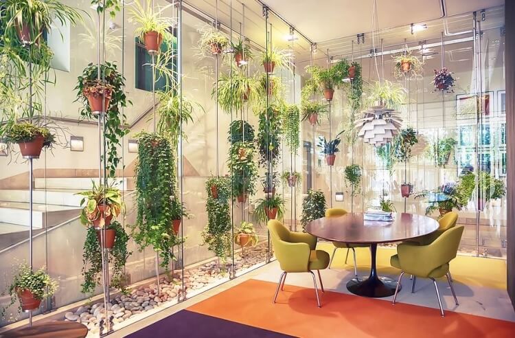
Plants – Live plants into the workplace are extremely important for many reasons. The first, and most obvious, is the increase in indoor air quality when plants are in a space helping to purify the air. The second is that, according to NBC News, seeing nature’s beautiful greenery can help us feel more relaxed and calm, which in turn benefits your mood (See link here: https://www.nbcnews.com/better/health/indoor-plants-can-instantly-boost-your-health-happiness-ncna781806).
Artwork – Take a look around the space at the artwork as this has a very strong influence on employees subconscious thoughts. Is it calming? Beautiful places? Or are you showing storm clouds and jagged mountains? The artwork should reflect company branding and mission, images of “togetherness”, calming scenes and words of encouragement.
Color – Color psychology is a topic for discussion all on its own, but in the realm of Feng Shui, the rule is to blend in a nice mix of colors in many different areas and try to incorporate the branding colors into the space. It’s ok if the hues aren’t exactly the same as the logo but just having them relatively close will help reinforce the brand throughout the space.
Color Theory
As far as specific colors go, here’s a short intro to color theory on specific colors:
- Red is a very emotionally intense color. It enhances human metabolism, increases respiration rate, and raises blood pressure. It has very high visibility, which is why stop signs, stoplights, and fire equipment are usually painted red. In heraldry, red is used to indicate courage. It is a color found in many national flags.
- Orange combines the energy of red and the happiness of yellow. It is associated with joy, sunshine, and the tropics. Orange represents enthusiasm, fascination, happiness, creativity, determination, attraction, success, encouragement, and stimulation.
- Yellow is the color of sunshine. It’s associated with joy, happiness, intellect, and energy. Yellow produces a warming effect, arouses cheerfulness, stimulates mental activity, and generates muscle energy.
- Green is the color of nature. It symbolizes growth, harmony, freshness, and fertility. Green has strong emotional correspondence with safety. Dark green is also commonly associated with money. Green has great healing power. It is the most restful color for the human eye; it can improve vision. Green suggests stability and endurance
- Blue is the color of the sky and sea. It is often associated with depth and stability. It symbolizes trust, loyalty, wisdom, confidence, intelligence, faith, truth, and heaven. Blue is considered beneficial to the mind and body. It slows human metabolism and produces a calming effect. Blue is strongly associated with tranquility and calmness.
- Purple combines the stability of blue and the energy of red. Purple is associated with royalty. It symbolizes power, nobility, luxury, and ambition. It conveys wealth and extravagance. Purple is associated with wisdom, dignity, independence, creativity, mystery, and magic. According to surveys, almost 75 percent of pre-adolescent children prefer purple to all other colors.
- White is associated with light, goodness, innocence, purity, and virginity. It is considered to be the color of perfection. White means safety, purity, and cleanliness. As opposed to black, white usually has a positive connotation. White can represent a successful beginning.
- Black is associated with power, elegance, formality, death, evil, and mystery. Black is a mysterious color associated with fear and the unknown (black holes). It usually has a negative connotation (blacklist, black humor, ‘black death’).